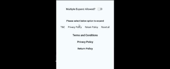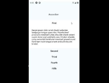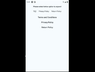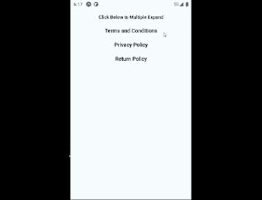
Single Collapsible
June 13, 2022
1 min
Animated collapsible component for React Native using the new Animated API with fallback. Good for accordions, toggles etc
npm install --save react-native-collapsible
and
npm install --save react-native-animatable
and
npm install --save react-native-collapsible-accordion
// Example of Collapsible/Accordion/Expandable List View in React Native
// https://aboutreact.com/collapsible-accordion-expandable-view/

// import React in our code
import React, { useState } from 'react';

// import all the components we are going to use
import {
  SafeAreaView,
  Switch,
  ScrollView,
  StyleSheet,
  Text,
  View,
  TouchableOpacity,
} from 'react-native';

//import for the animation of Collapse and Expand
import * as Animatable from 'react-native-animatable';

//import for the collapsible/Expandable view
import Collapsible from 'react-native-collapsible';

//import for the Accordion view
import Accordion from 'react-native-collapsible/Accordion';

//Dummy content to show
//You can also use dynamic data by calling web service
const CONTENT = [
  {
    title: 'Terms and Conditions',
    content:
      'The following terms and conditions, together with any referenced documents (collectively, "Terms of Use") form a legal agreement between you and your employer, employees, agents, contractors and any other entity on whose behalf you accept these terms (collectively, “you” and “your”), and ServiceNow, Inc. (“ServiceNow,” “we,” “us” and “our”).',
  },
  {
    title: 'Privacy Policy',
    content:
      'A Privacy Policy agreement is the agreement where you specify if you collect personal data from your users, what kind of personal data you collect and what you do with that data.',
  },
  {
    title: 'Return Policy',
    content:
      'Our Return & Refund Policy template lets you get started with a Return and Refund Policy agreement. This template is free to download and use.According to TrueShip study, over 60% of customers review a Return/Refund Policy before they make a purchasing decision.',
  },
];

//To make the selector (Something like tabs)
const SELECTORS = [
  { title: 'T&C', value: 0 },
  { title: 'Privacy Policy', value: 1 },
  { title: 'Return Policy', value: 2 },
  { title: 'Reset all' },
];

const App = () => {
  // Ddefault active selector
  const [activeSections, setActiveSections] = useState([]);
  // Collapsed condition for the single collapsible
  const [collapsed, setCollapsed] = useState(true);
  // MultipleSelect is for the Multiple Expand allowed
  // True: Expand multiple at a time
  // False: One can be expand at a time
  const [multipleSelect, setMultipleSelect] = useState(false);

  const toggleExpanded = () => {
    //Toggling the state of single Collapsible
    setCollapsed(!collapsed);
  };

  const setSections = (sections) => {
    //setting up a active section state
    setActiveSections(sections.includes(undefined) ? [] : sections);
  };

  const renderHeader = (section, _, isActive) => {
    //Accordion Header view
    return (
      <Animatable.View
        duration={400}
        style={[styles.header, isActive ? styles.active : styles.inactive]}
        transition="backgroundColor">
        <Text style={styles.headerText}>{section.title}</Text>
      </Animatable.View>
    );
  };

  const renderContent = (section, _, isActive) => {
    //Accordion Content view
    return (
      <Animatable.View
        duration={400}
        style={[styles.content, isActive ? styles.active : styles.inactive]}
        transition="backgroundColor">
        <Animatable.Text
          animation={isActive ? 'bounceIn' : undefined}
          style={{ textAlign: 'center' }}>
          {section.content}
        </Animatable.Text>
      </Animatable.View>
    );
  };

  return (
    <SafeAreaView style={{ flex: 1 }}>
      <View style={styles.container}>
        <ScrollView>
          {/*Code for Single Collapsible Start*/}
          <TouchableOpacity onPress={toggleExpanded}>
            <View style={styles.header}>
              <Text style={styles.headerText}>Single Collapsible</Text>
              {/*Heading of Single Collapsible*/}
            </View>
          </TouchableOpacity>
          {/*Content of Single Collapsible*/}
          <Collapsible collapsed={collapsed} align="center">
            <View style={styles.content}>
              <Text style={{ textAlign: 'center' }}>
                This is a dummy text of Single Collapsible View
              </Text>
            </View>
          </Collapsible>
          {/*Code for Single Collapsible Ends*/}

          <View style={{ backgroundColor: '#000', height: 1, marginTop: 10 }} />
          <View style={styles.multipleToggle}>
            <Text style={styles.multipleToggle__title}>
              Multiple Expand Allowed?
            </Text>
            <Switch
              value={multipleSelect}
              onValueChange={(multipleSelect) =>
                setMultipleSelect(multipleSelect)
              }
            />
          </View>
          <Text style={styles.selectTitle}>
            Please select below option to expand
          </Text>

          {/*Code for Selector starts here*/}
          <View style={styles.selectors}>
            {SELECTORS.map((selector) => (
              <TouchableOpacity
                key={selector.title}
                onPress={() => setSections([selector.value])}
                //on Press of any selector sending the selector value to
                // setSections function which will expand the Accordion accordingly
              >
                <View style={styles.selector}>
                  <Text
                    style={
                      activeSections.includes(selector.value) &&
                      styles.activeSelector
                    }>
                    {selector.title}
                  </Text>
                </View>
              </TouchableOpacity>
            ))}
          </View>
          {/*Code for Selector ends here*/}

          {/*Code for Accordion/Expandable List starts here*/}
          <Accordion
            activeSections={activeSections}
            //for any default active section
            sections={CONTENT}
            //title and content of accordion
            touchableComponent={TouchableOpacity}
            //which type of touchable component you want
            //It can be the following Touchables
            //TouchableHighlight, TouchableNativeFeedback
            //TouchableOpacity , TouchableWithoutFeedback
            expandMultiple={multipleSelect}
            //Do you want to expand mutiple at a time or single at a time
            renderHeader={renderHeader}
            //Header Component(View) to render
            renderContent={renderContent}
            //Content Component(View) to render
            duration={400}
            //Duration for Collapse and expand
            onChange={setSections}
            //setting the state of active sections
          />
          {/*Code for Accordion/Expandable List ends here*/}
        </ScrollView>
      </View>
    </SafeAreaView>
  );
};

export default App;

const styles = StyleSheet.create({
  container: {
    flex: 1,
    backgroundColor: '#F5FCFF',
    paddingTop: 30,
  },
  title: {
    textAlign: 'center',
    fontSize: 18,
    fontWeight: '300',
    marginBottom: 20,
  },
  header: {
    backgroundColor: '#F5FCFF',
    padding: 10,
  },
  headerText: {
    textAlign: 'center',
    fontSize: 16,
    fontWeight: '500',
  },
  content: {
    padding: 20,
    backgroundColor: '#fff',
  },
  active: {
    backgroundColor: 'rgba(255,255,255,1)',
  },
  inactive: {
    backgroundColor: 'rgba(245,252,255,1)',
  },
  selectors: {
    marginBottom: 10,
    flexDirection: 'row',
    justifyContent: 'center',
  },
  selector: {
    backgroundColor: '#F5FCFF',
    padding: 10,
  },
  activeSelector: {
    fontWeight: 'bold',
  },
  selectTitle: {
    fontSize: 14,
    fontWeight: '500',
    padding: 10,
    textAlign: 'center',
  },
  multipleToggle: {
    flexDirection: 'row',
    justifyContent: 'center',
    marginVertical: 30,
    alignItems: 'center',
  },
  multipleToggle__title: {
    fontSize: 16,
    marginRight: 8,
  },
});
Quick Links
Legal Stuff


