


Vertical Step indicator
May 06, 2023
1 min
Display some placeholder stuff before rendering your text or media content in React Native. It is a library for React Native that provides a set of placeholder components to display in place of actual content while data is being loaded or processed. This library can be useful for improving the user experience of your app by providing visual cues to indicate that something is happening, rather than leaving a blank or unresponsive screen.
With rn-placeholder, you can easily create and customize placeholder components for various types of content, such as text, images, and lists. The library provides a number of built-in placeholder styles that you can use out of the box, or you can create your own custom styles with CSS-like syntax.
These props can be used with any of the placeholder components. • onReady: A boolean value that determines whether to show the placeholder or the actual content. If true, the placeholder will be hidden and the actual content will be shown. • delay: The number of milliseconds to wait before showing the placeholder. This can be useful for avoiding flickering effects when loading data. • animation: The type of animation to use when transitioning from the placeholder to the actual content. This can be a string representing the animation type (“fade”, “shine”, “flash”, “pulse”, “slide”), or a custom animation object. • style: A style object to apply to the placeholder component.
These props can be used with the Text and MultiWords placeholder components. • color: The color of the placeholder text. • lineNumber: The number of lines of text to display. • lineSpacing: The vertical spacing between lines of text. • lastLineWidth: The width of the last line of text, as a percentage of the total width. • firstLineWidth: The width of the first line of text, as a percentage of the total width.
These props can be used with the ImageContent placeholder component. • size: The size of the placeholder image, in pixels. • style: A style object to apply to the placeholder image. • animate: The type of animation to use when transitioning from the placeholder image to the actual image. • customPlaceholder: A custom React component to use as the placeholder instead of the default one. • showLoadingAnimation: A boolean value that determines whether to show a loading animation in place of the placeholder image.
These props can be used with the List placeholder component. • width: The width of the list item placeholder, in pixels. • height: The height of the list item placeholder, in pixels. • itemCount: The number of list items to display. • onRenderItem: A function that takes an index and returns a React component to use as the placeholder for that list item.
npm i rn-placeholder
Or
yarn add rn-placeholder
Required Files
import React from "react";
import { StyleSheet, View, ViewProps } from "react-native";

export const Card = ({ children, style, dark, ...props }) => (
  <View style={[styles.card, style, dark && styles.dark]} {...props}>
    {children}
  </View>
);

const styles = StyleSheet.create({
  card: {
    backgroundColor: "darkgrey",
    borderRadius: 5,
    elevation: 3,
    marginBottom: 12,
    padding: 20
  },
  dark: {
    backgroundColor: "#111111"
  }
});
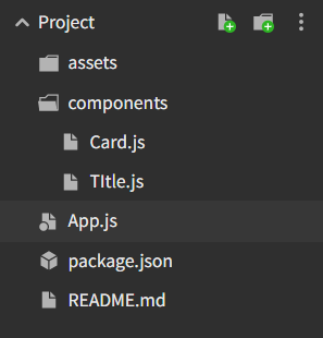
“App.js” file
import * as React from 'react';
import {
  Text,
  View,
  ScrollView,
  StyleSheet,
  Clipboard,
  Alert,
  Button,
} from 'react-native';
import { Constants } from 'expo';
import {
  Placeholder,
  PlaceholderMedia,
  PlaceholderLine,
  Fade,
} from 'rn-placeholder';
import { Card } from './components/Card';
import { Title } from './components/TItle';

export default class App extends React.Component {
  copy = content => () => {
    Clipboard.setString(content);
    Alert.alert('Copied!');
  };

  render() {
    return (
      <ScrollView style={styles.container}>
        <Card>
          <Title>Fade</Title>
          <Placeholder
            Left={PlaceholderMedia}
            Right={PlaceholderMedia}
            Animation={Fade}>
            <PlaceholderLine width={80} />
            <PlaceholderLine />
            <PlaceholderLine width={30} />
          </Placeholder>

          <View style={styles.button}>
            <Button
              title="Copy to clipboard"
              onPress={this.copy(`<Placeholder
            Left={PlaceholderMedia}
            Right={PlaceholderMedia}
            Animation={Fade}>
            <PlaceholderLine width={80} />
            <PlaceholderLine />
            <PlaceholderLine width={30} />
          </Placeholder>`)}
            />
          </View>
        </Card>

      </ScrollView>
    );
  }
}

const styles = StyleSheet.create({
  container: {
    padding: 20,
    marginTop:200,
  },
  button: {
    marginTop: 20,
  },
});
Coming Soon…
Quick Links
Legal Stuff


