Basic Timeline Listview
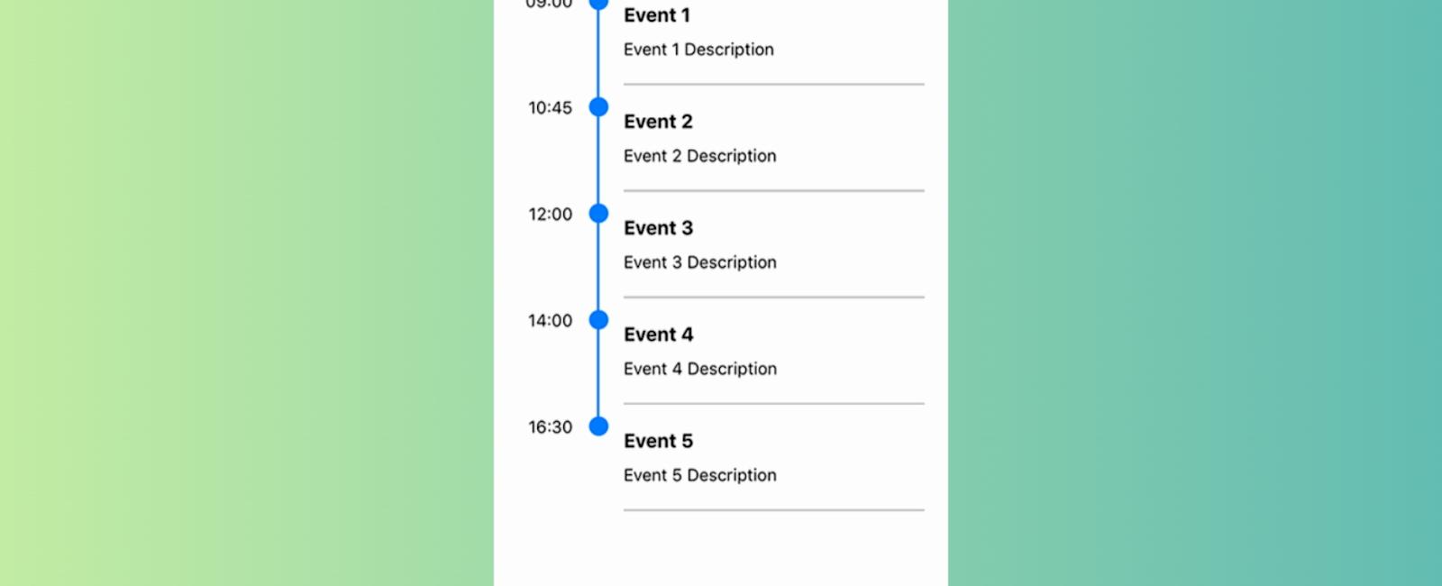
Table Of Contents
Introduction
Hey there, React Native enthusiasts! Are you tired of boring, bland-looking lists in your mobile apps? Do you want to add some excitement and style to your app’s timeline? Then you’re in luck because React Native Timeline Listview is here to save the day!
But before we dive in and get technical, let’s set the mood with a joke.
Why did the developer quit his job at the calendar factory? Because he took a day off.
Okay, okay, I know that was cheesy. But I couldn’t resist! Let’s get back on track and start using this awesome library.
Getting started:
First things first, let’s install the library. Now, I know what you’re thinking. “Oh no, more installation steps? I’m going to die of boredom.” But fret not, my friend! Installing this library is easier than stealing candy from a baby. (Note: Please do not actually steal candy from babies. That’s just mean.)
All you have to do is run this command in your terminal:
npm install react-native-timeline-listview
And that’s it! You’re ready to use the library. It’s like magic, but without the hassle of chanting spells or waving a wand.
Usage:
Now, let’s jump into the code. First, you’ll need to import the Timeline component:
import Timeline from 'react-native-timeline-listview';
Next, you’ll need to create some data to populate your timeline. Here’s an example:
const data = [
  { time: "09:00", title: "Wake up", description: "Start your day off right" },
  {
    time: "10:00",
    title: "Brush your teeth",
    description: "Don’t forget to floss!",
  },
  {
    time: "11:00",
    title: "Take a shower",
    description: "Sing like no one is listening",
  },
  { time: "12:00", title: "Lunch time", description: "Nom nom nom" },
  { time: "13:00", title: "Nap time", description: "Zzzzzzzz" },
  {
    time: "14:00",
    title: "Coffee break",
    description: "Caffeine is my friend",
  },
  {
    time: "15:00",
    title: "Code like a boss",
    description: "I am the master of code",
  },
  { time: "18:00", title: "Dinner time", description: "Food is love" },
  {
    time: "20:00",
    title: "Watch Netflix",
    description: "Because I deserve it",
  },
  { time: "23:00", title: "Bed time", description: "Goodnight, world" },
];
And finally, you’ll need to render the Timeline component
<Timeline
  data={data}
  circleSize={20}
  circleColor="rgb(45,156,219)"
  lineColor="rgb(45,156,219)"
  timeContainerStyle={{
    minWidth: 52,
  }}
  timeStyle={{
    textAlign: "center",
    backgroundColor: "#ff9797",
    color: "white",
    padding: 5,
    borderRadius: 13,
  }}
  descriptionStyle={{
    color: "gray",
  }}
  options={{
    style: {
      paddingTop: 5,
    },
  }}
/>;
And voila! You now have a beautiful, stylish timeline in your React Native app. Wasn’t that easy?
Complete Example
import React, { Component } from 'react';
import { StyleSheet, View } from 'react-native';
import Timeline from 'react-native-timeline-flatlist';

export default class App extends Component {
  constructor(props) {
    super(props);
    this.data = [
      { time: '09:00', title: 'Event 1', description: 'Event 1 Description' },
      { time: '10:45', title: 'Event 2', description: 'Event 2 Description' },
      { time: '12:00', title: 'Event 3', description: 'Event 3 Description' },
      { time: '14:00', title: 'Event 4', description: 'Event 4 Description' },
      { time: '16:30', title: 'Event 5', description: 'Event 5 Description' }
    ];
  }

  render() {
    return (
      <View style={styles.container}>
        <Timeline
          data={this.data}
          options={{
            style:{ paddingTop:5, flex:1 }
          }}
        />
      </View>
    );
  }
}

const styles = StyleSheet.create({
  container: {
    flex: 1,
    paddingTop: 50,
    backgroundColor: '#F5FCFF',
    paddingHorizontal: 20
  }
});
Configuration
Data Object:
| Property | Type | Default | Description |
|---|---|---|---|
| time | string | null | event time |
| title | string | null | event title |
| description | string | null | event description |
| lineWidth | int | same as lineWidth of ‘Timeline’ | event line width |
| lineColor | string | same as lineColor of ‘Timeline’ | event line color |
| circleSize | int | same as circleSize of ‘Timeline’ | event circle size |
| circleColor | string | same as circleColor of ‘Timeline’ | event circle color |
| dotColor | string | same as dotColor of ‘Timeline’ | event dot color (innerCircle = ‘dot’) |
| icon | obj(image source) | same as icon of ‘Timeline’ | event icon (innerCircle = ‘color’) |
Timeline:
| Property | Type | Default | Description |
|---|---|---|---|
| data | data object | null | timeline data |
| innerCircle | string | null | timeline mode : ‘none’, ‘dot’, ‘icon’ |
| separator | bool | true | render separator line of events |
| columnFormat | string | ‘single-left’ | can be ‘single-column-left’, ‘single-column-right’, ‘two-column’ |
| lineWidth | int | 2 | timeline line width |
| lineColor | string | ‘#007AFF’ | timeline line color |
| circleSize | int | 16 | timeline circle size |
| circleColor | string | ‘#007AFF’ | timeline circle color |
| dotColor | string | ‘white’ | timeline dot color (innerCircle = ‘dot’) |
| icon | obj(image source) | null | timeline icon (innerCircle = ‘color’) |
| style | object | null | custom styles of Timeline container |
| listViewStyle | object | null | custom styles of inner ListView |
| timeStyle | object | null | custom styles of event time |
| titleStyle | object | null | custom styles of event title |
| descriptionStyle | object | null | custom styles of event description |
| iconStyle | object | null | custom styles of event icon |
| separatorStyle | object | null | custom styles of separator |
| rowContainerStyle | object | null | custom styles of event container |
| timeContainerStyle | object | null | custom styles of container of event time |
| detailContainerStyle | object | null | custom styles of container of event title and event description |
| onEventPress | function(event) | null | function to be invoked when event was pressed |
| renderTime | function(rowData, sectionID, rowID) | null | custom render event time |
| renderDetail | function(rowData, sectionID, rowID) | null | custom render event title and event description |
| renderCircle | function(rowData, sectionID, rowID) | null | custom render circle |
| renderFullLine | bool | false | render event border on last timeline item |
| options | object | null | ListView properties |
| showTime | boolean | true | Time container options |
# Tutorial
Coming Soon...

export const _frontmatter = {}
Related Posts

Quick Links
Legal Stuff

